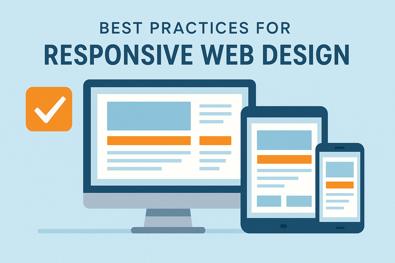
In today’s multi-device world, responsive web design is no longer optional—it’s essential. Visitors expect a seamless experience whether they’re browsing on a desktop monitor, a tablet, or a mobile phone. A well-designed responsive website improves usability, accessibility, and search engine visibility. Below are the best practices every designer and developer should follow to create adaptive, device-friendly websites.
1. Use a Mobile-First Approach
Starting your design with mobile devices ensures that content is prioritized and layouts stay clean and simple. After building the mobile version, you can progressively enhance the design for larger screens.
Benefits include:
- Faster load times
- Improved accessibility
- Better user experience on small screens (60–70% of traffic for most sites)
2. Implement Flexible Layouts With CSS Grid and Flexbox
Fixed-width layouts don’t adapt well to different screen sizes. Tools like Flexbox and CSS Grid help layouts stretch, shrink, and rearrange smoothly.
Best practices:
- Use percentage-based widths
- Avoid fixed heights
- Use min/max properties to prevent extreme scaling
3. Optimize Images for All Devices
Large, unoptimized images are one of the biggest performance blockers on mobile. Use modern solutions to ensure fast loading and crisp visuals.
Tips:
- Serve images in WebP or AVIF format
- Use
srcsetandsizesattributes for responsive image loading - Lazy-load below-the-fold assets
4. Use Responsive Typography
Text must remain legible on every screen size. Use relative units like em, rem, and viewport units (vw, vh).
Recommendations:
- Maintain at least 16px base font size
- Use line height between 1.4–1.7
- Adjust heading sizes with media queries or clamp() functions
5. Apply Thoughtful Breakpoints
Breakpoints should respond to your layout, not specific devices. Designing around content ensures your layout reflows naturally.
Common breakpoints (as references only):
- 480px (small mobile)
- 768px (tablets)
- 1024px (small desktop)
- 1280px (large screens)
Use a mix of predefined and content-driven breakpoints.
6. Prioritize Performance
Responsive design is not just visual—fast load times make or break the user experience.
Performance tips:
- Minify CSS/JS
- Use a CDN
- Defer non-critical scripts
- Cache aggressively
- Avoid heavy animations on mobile
7. Ensure Touch-Friendly Navigation
Mobile users rely on their thumbs. Navigation should be comfortable, intuitive, and easy to tap.
Best practices:
- Minimum tap target: 44px × 44px
- Avoid hover-only interactions
- Keep menus simple and collapsible
8. Test Across Real Devices
Tools like Chrome DevTools are great, but nothing replaces real device testing.
Test for:
- Layout consistency
- Tap targets
- Loading speed
- Font readability
- Orientation changes
9. Use Fluid Media and Embed Responsively
Videos, maps, and other embeds should scale with the layout.
Wrap them in containers with:
iframe { width: 100%; height: auto; }
Or use modern CSS aspect-ratio support:
.aspect-video { aspect-ratio: 16 / 9; }
10. Keep Accessibility in Mind
Responsiveness and accessibility go hand-in-hand.
Key considerations:
- Ensure sufficient color contrast
- Provide scalable text
- Use ARIA labels and semantic HTML
- Avoid content shifts (CLS issues)
Conclusion
Responsive design isn’t a trend—it’s the foundation of modern web experiences. By combining flexible layouts, performance optimization, accessible design, and thorough testing, you can create websites that feel natural on any device. Whether you’re designing your first site or refining your workflow, following these best practices will help you deliver a high-quality, user-friendly experience.